The case:
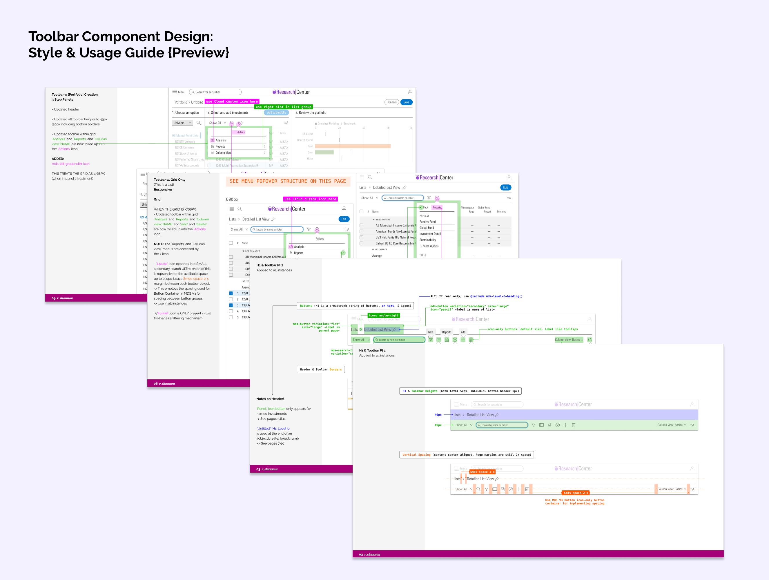
When my team and I began renovating a heavily-used, legacy application, we quickly realized the effort would require strong, centralized documentation for designers and developers to reference in order to replicate like workflows, create visual consistency, and help unify logic.

The role:
For this project, I assumed the role of interaction designer. I was in charge of creating and curating a framework system for our product that worked within the brand style guide, used and/or contributed to our centralized design system, and also worked for our users; some of whom had been relying on this application long before there was ever branding.
The solve:
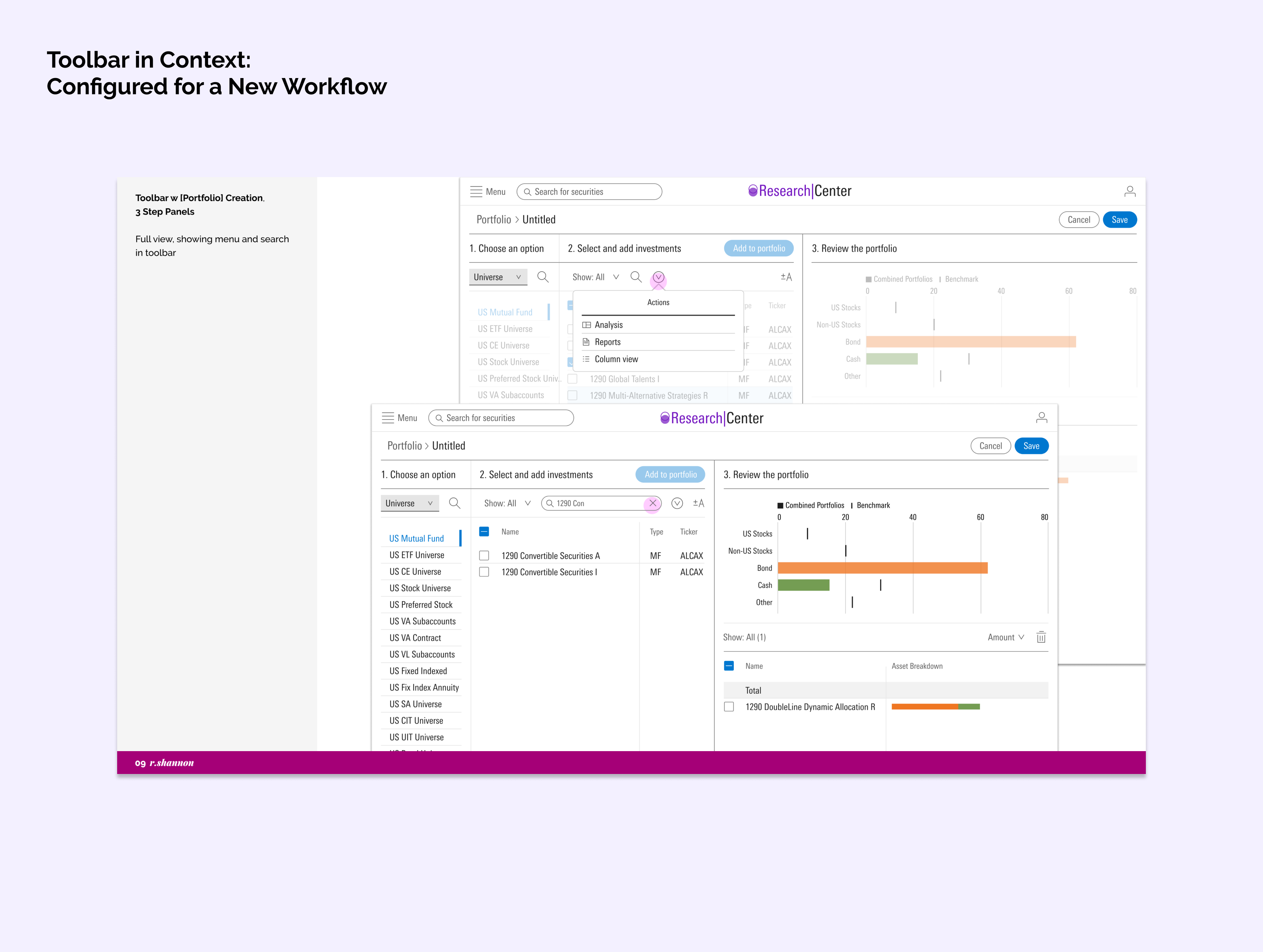
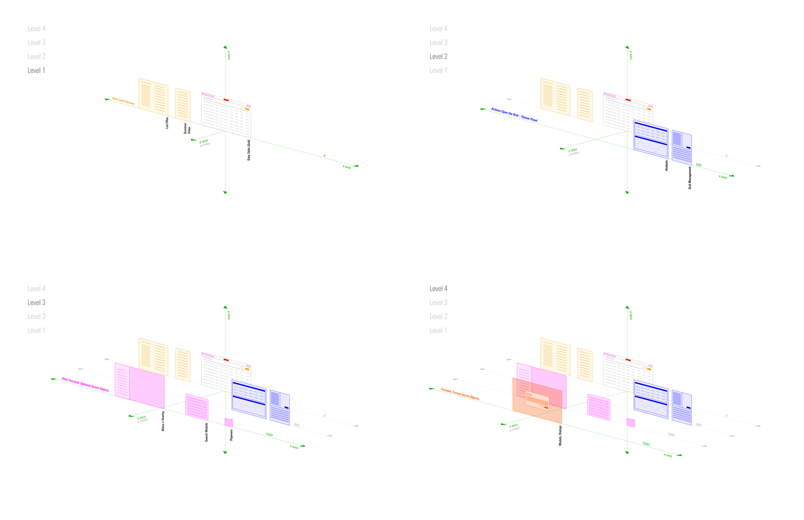
This document functioned as a source of truth: a style guide and pattern library for our work. We started by creating a z-axis layering system to help determine what UI to use for what instance. Over time, we centralized all our page’s actions around a common header and toolbar style.
Not only did we find this crucial for the team as we created more screens and functions, but ultimately helpful for the user as well. The lesson here? We create trust, familiarity and ease of use within products, large and small, when we are consistent in our decisions.

