Raina Shannon

Firefly Fiber Arts Studio – Brand Design
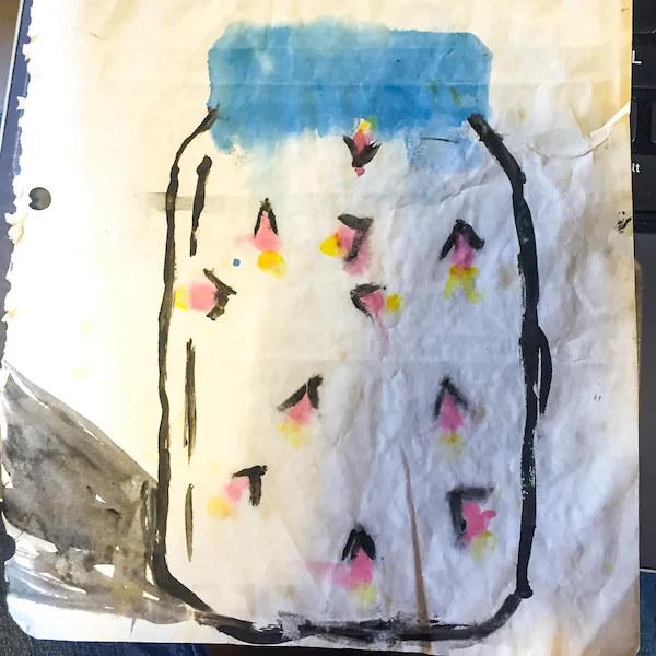
A child's ink and watercolor drawing on wrinkled, off-white paper showing a mason jar filled with fireflies. The jar has a bold black outline and a blue-painted lid, and the interior contains scattered pink and yellow watercolor splotches representing glowing fireflies.

Inspiration for the name and branding of Firefly Fiber Arts Studio came from a drawing the client's sister made as a child.
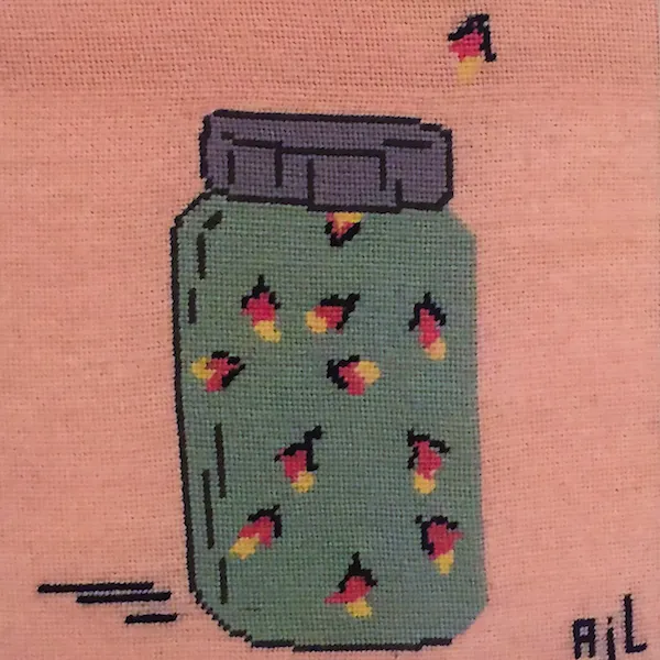
A cross-stitch piece on pink fabric showing a mason jar filled with fireflies. The jar has a grey lid and a teal body containing several stitched fireflies with pink bodies and yellow glowing tails, with one stray firefly floating outside above the jar.

Later, their grandmother made a cross stitch piece inspired by this playful image of fireflies caught in a jar, and the two became special to the family, especially after the passing of the sister.

Wanting to include these beloved women in the development of this creative business, the client and I worked together to create a simple, playful brand mark that not only served to honor her family, but also subtly spoke to the mission to sell only sustainable materials and to be as plastic free as possible.
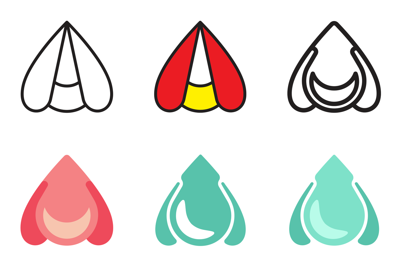
An animated GIF of the early stages of the firefly logo. Starting with a black-and-white outline, then adding color, then redesigning the wings and body. Finally adding finalized brand coloring of shades of green.

The client opened Firefly Fiber Arts Studio as a way to "be a light" – to inspire others to be makers the way her family has inspired her, and to help raise awareness about crafting with sustainable and eco-friendly materials.
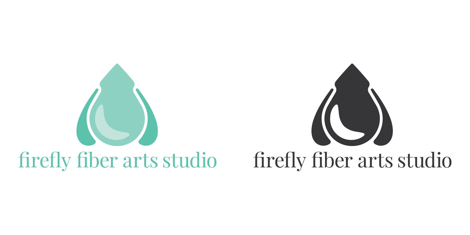
An animated GIF of the logo with

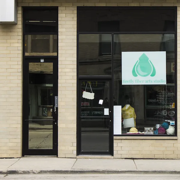
A photo of the storefront for

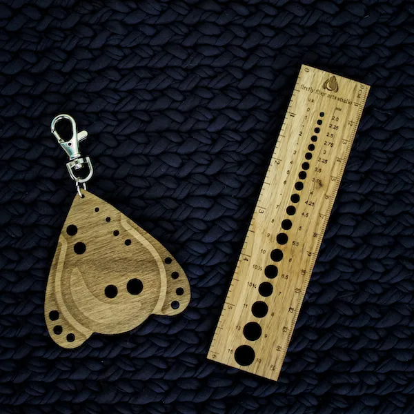
A photo of custom wooden knitting tools resting on a dark blue, chunky knit background: a teardrop-shaped needle gauge shaped like the firefly-yarn logo with a keychain clasp, and a rectangular wooden ruler featuring measurement markings and the

Back to Visual Design

#visual