Desktop-to-Mobile UX
The case:
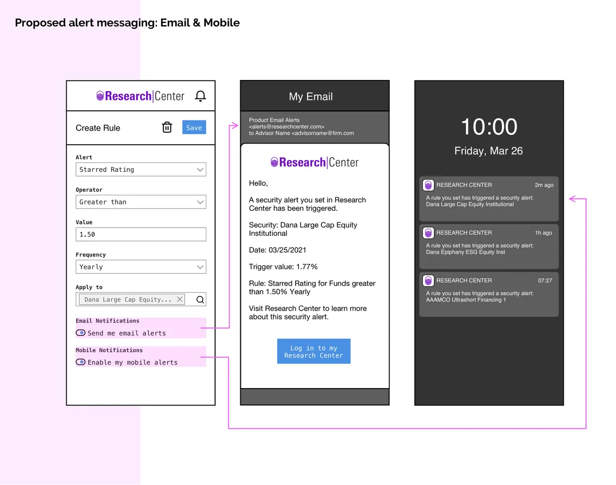
While working on our web application’s alert capability, I had to solve for a way to set, edit and view notification rules in a way suited to the mobile experience. I also had to propose content for the push notifications and emails that didn’t expose any sensitive data outside this secure app, while still providing value by being clear what the notification was for.
The role:
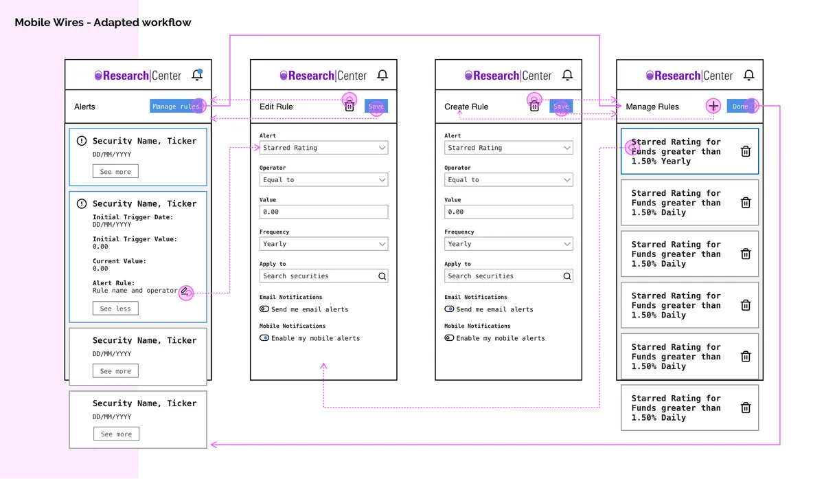
As the interaction designer responsible for the framework of the product, I worked with our mobile development team to understand various workflows as they translated to a mobile experience. In this, I advised the team in a UX capacity, and provided workflow updates for the unique opportunities a mobile environment poses, such as scrolling and viewing data-dense information.
The solve:
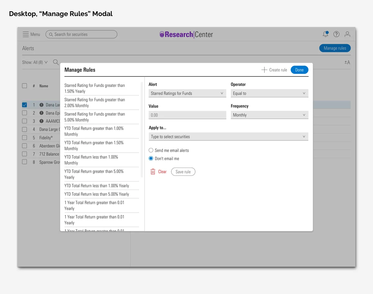
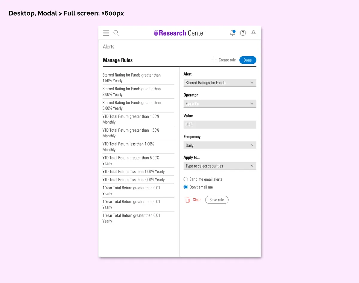
The design system my product used was still growing in the mobile element department, and there was no ready-to-use table for mobile data. I directed a new order of information for the mobile notification experience: As opposed to data tables and lists, I outlined an editable card function with more focused actions than our desktop app — For the user’s scrolling and visual scanning ease.
These cards could expand for more information on what items triggered an alert rule, and review the rule criteria themselves. I also defined what parts of the cards’ data could be securely surfaced as content in a potentially in-public mobile alert or email (being on a user’s un/locked phone), while still being clear as to what the alert is.