Raina Shannon

Data Science Design

The case:

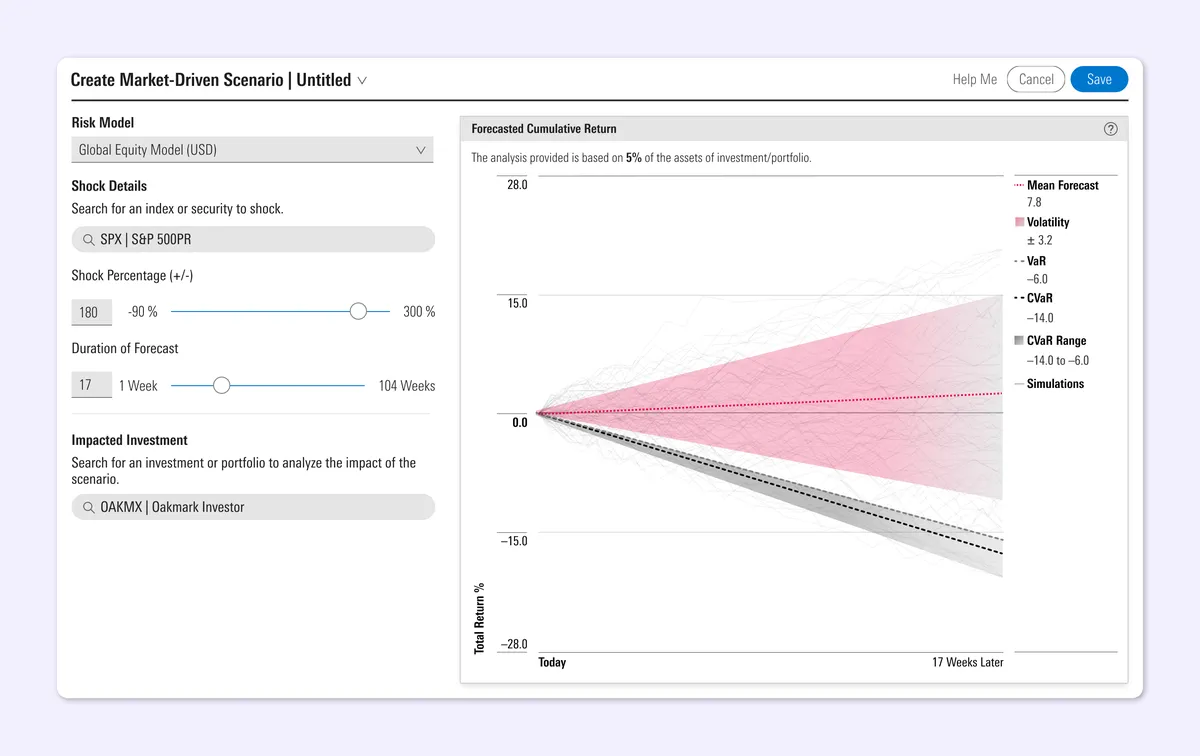
These charts are data visualizations that are the output of a new functionality to the users of a market analysis app. We worked granular data science and program-generated outcomes into a simplified tool as a way to conduct a process (and a bit of fortune-telling) called economic Scenario Analysis.

The main challenge was to translate something very programmatic into visuals that can be more easily understood by those who are more focused on seeing results — and to do so within an UI where users can understand the order of operations.
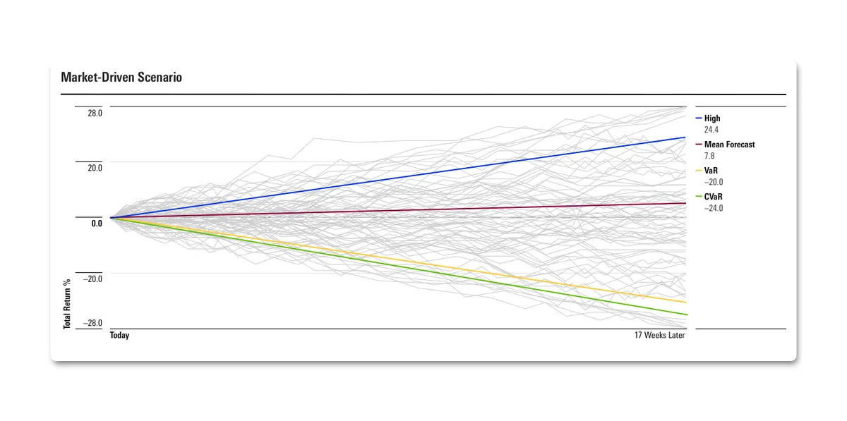
Data visualization titled 'Market-Driven Scenario' displaying a financial forecast chart with 'Total Return %' on the vertical axis ranging from -28.0 to 28.0, and time from 'Today' to '17 Weeks Later' on the horizontal axis. Numerous light gray lines represent individual Monte Carlo simulation runs. Four distinct colored lines highlight key metrics at 17 weeks: a blue line for High (24.4%), a dark red line for Mean Forecast (7.8%), a yellow line for VaR (-20.0%), and a green line for CVaR (-24.0%).

The role:

As the visual designer on a team of engineers focused on risk modeling, I worked with my UX partner and the agency’s data scientists to interpret this complex methodology as a tool for understanding how scenarios create, or don’t create, risk.
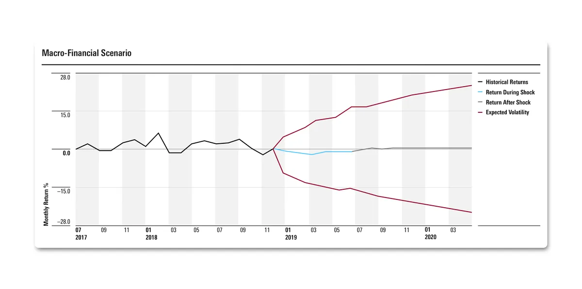
Data visualization titled 'Macro-Financial Scenario' displaying a financial forecast chart with 'Monthly Return %' on the vertical axis ranging from -28.0 to 28.0, and a timeline from July 2017 to April 2020 on the horizontal axis. A black line tracks historical returns up to late 2018/early 2019, at which point the chart branches out into forecast metrics: dark red lines indicating Expected Volatility boundaries, a light blue line showing Return During Shock, and a gray line representing Return After Shock.

The ultimate task in this project was in creating a visual result of a ran program — the charts shown — that visually distinguishes what is historical fact versus a simulated future: to make clear the difference between what is program-run, and what a user controls.
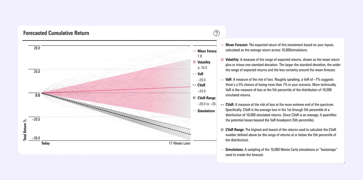
Data visualization titled 'Forecasted Cumulative Return' with an open tooltip card explaining financial terms. The chart features a 'Total Return %' vertical axis ranging from -28.0 to 28.0, and a timeline from 'Today' to '17 Weeks Later'. It highlights a dotted red Mean Forecast line (7.8), a pink-shaded Volatility range (±10.0\pm 10.0±10.0), a dashed VaR line (-20.0), a dashed CVaR line (-24.0), and a gray CVaR Range (-28.0 to -20.0) over faint background simulation lines. A pop-up panel on the right provides definitions for Mean Forecast, Volatility, VaR, CVaR, CVaR Range, and Simulations.

The solve:

Scenario Analysis is a tool meant both for the economist and the financial advisor. By employing color, different textures, and using area fill shapes instead of only lines to show range, we delivered on data visualization within a tool that is more accessible, offers more assistance to understanding complex methodology, and honors precision.
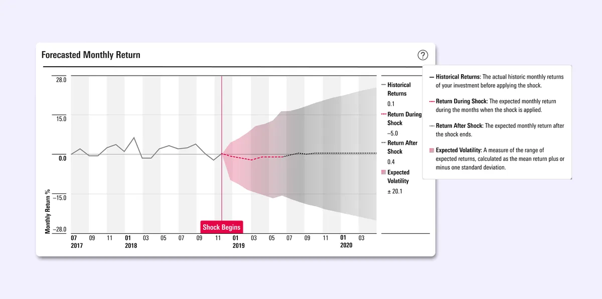
Data visualization titled 'Forecasted Monthly Return' displaying a financial chart with 'Monthly Return %' on the vertical axis ranging from -28.0 to 28.0, and a timeline from July 2017 to mid-2020. A solid gray line shows historical returns up to a vertical red line marking 'Shock Begins' in late 2018. From that point, pink and gray shaded areas depict Expected Volatility (±20.1\pm 20.1±20.1), alongside dashed and dotted lines representing Return During Shock (-5.0) and Return After Shock (0.4). An adjacent info panel provides definitions for Historical Returns, Return During Shock, Return After Shock, and Expected Volatility.

Interface design screenshot for creating a market-driven financial scenario. The left sidebar features configuration controls: a risk model dropdown ('Global Equity Model'), shock search input ('SPX | S&P 500PR'), a shock percentage slider set to -90%, a duration slider set to 17 weeks, and an impacted investment selector ('OAKMX | Oakmark Investor'). The right side displays a 'Forecasted Cumulative Return' chart showing a Monte Carlo simulation from 'Today' to '17 Weeks Later', with a red-shaded volatility band, a mean forecast line (7.8), and statistical markers for VaR (-6.0) and CVaR (-14.0).

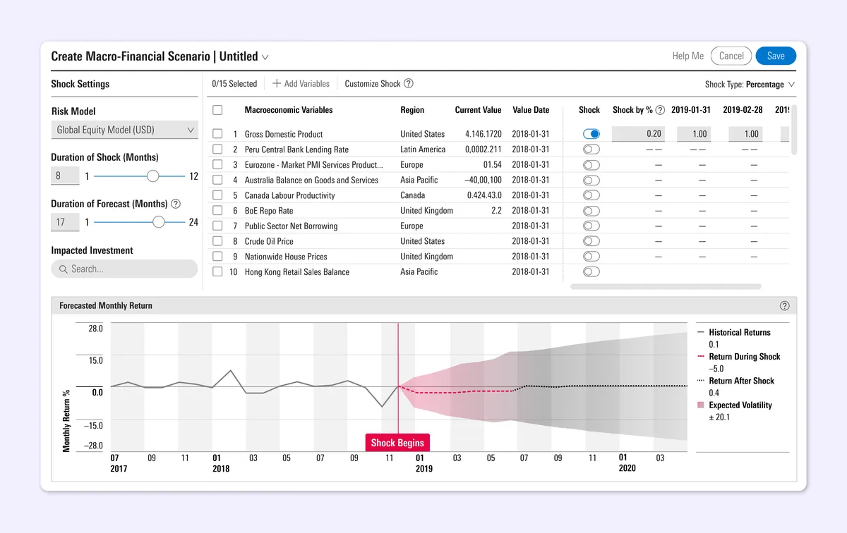
Interface design screenshot for creating a macro-financial scenario. The left sidebar contains settings for Risk Model ('Global Equity Model'), Duration of Shock (8 months), and Duration of Forecast (17 months). The center features a table listing macroeconomic variables like Gross Domestic Product and Peru Central Bank Lending Rate, with toggle switches and percentage adjustments. The bottom section displays a 'Forecasted Monthly Return' chart showing historical data leading into a 'Shock Begins' marker, with pink and gray shaded projections for expected volatility and return metrics.

Back to Portfolio

#caseStudy