The case:
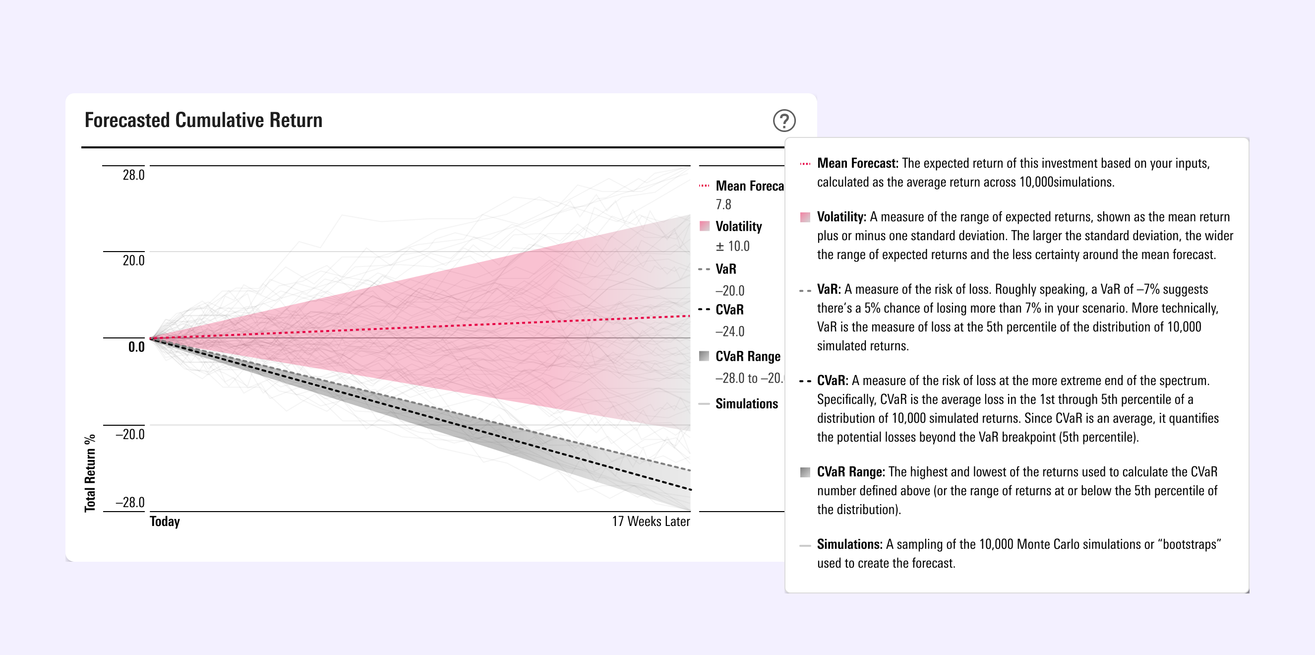
These charts are data visualizations that are the output of a new functionality to the users of a market analysis app. We worked granular data science and program-generated outcomes into a simplified tool as a way to conduct a process (and a bit of fortune-telling) called economic Scenario Analysis.
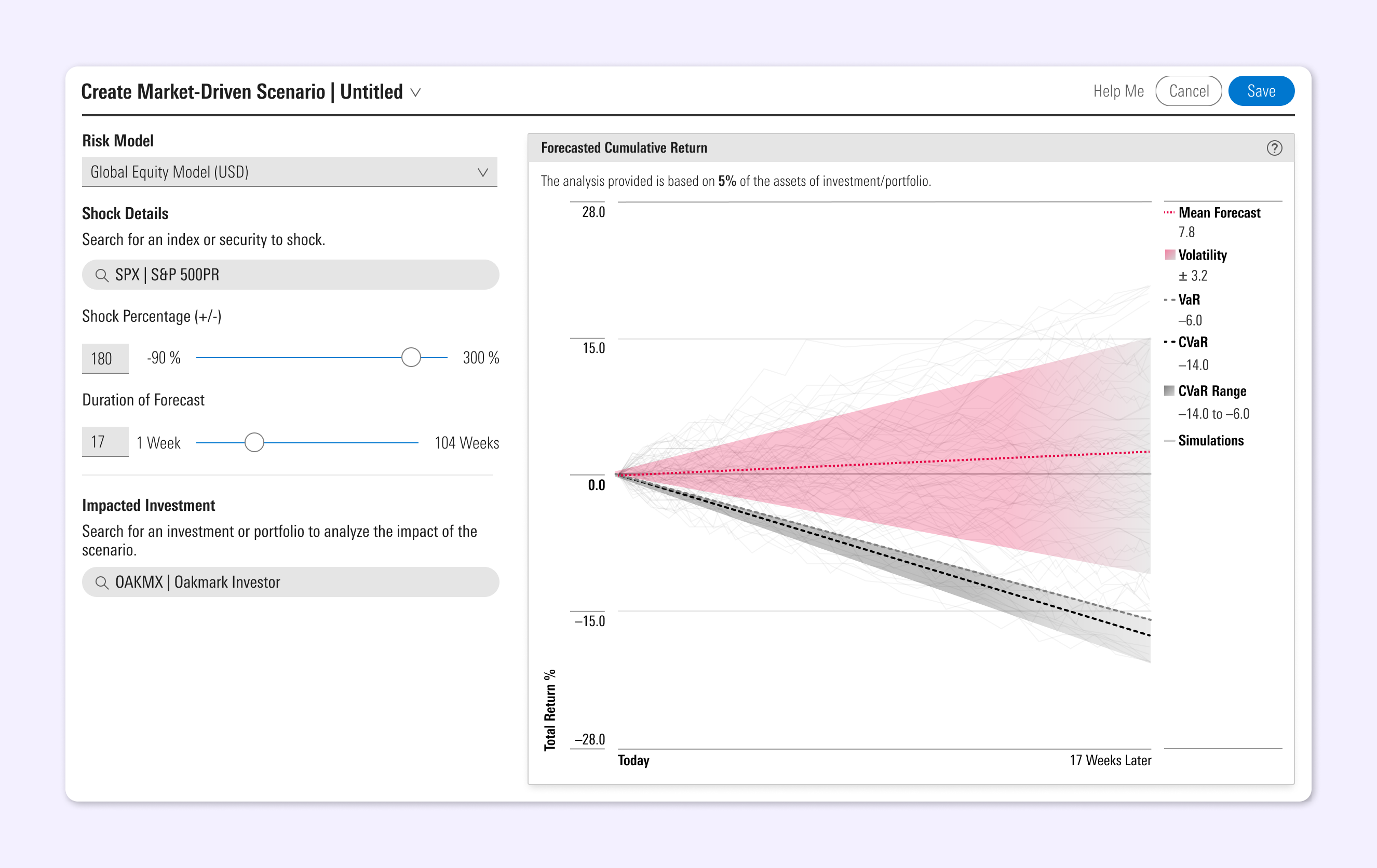
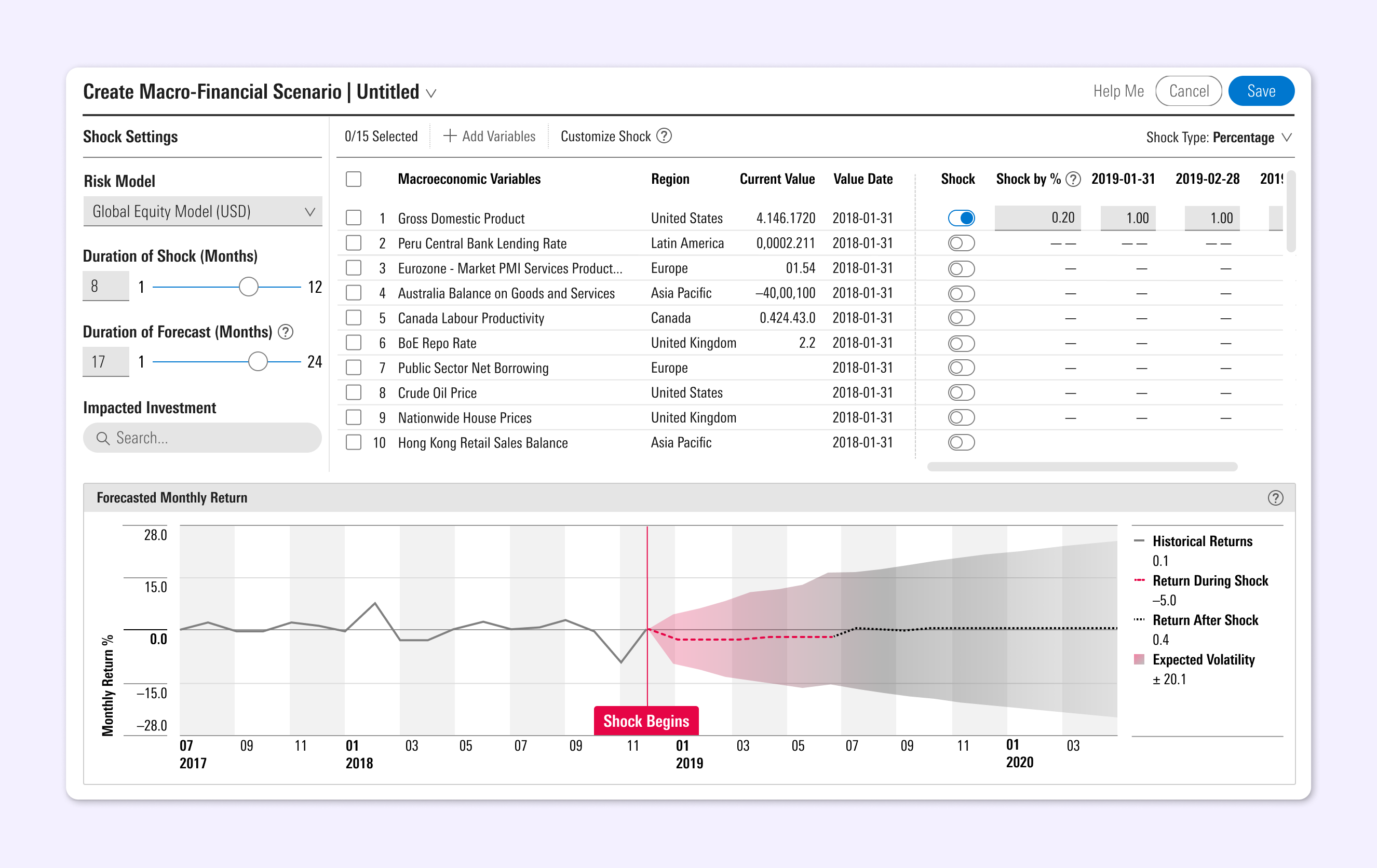
The main challenge was to translate something very programatic into visuals that can be more easily understood by those who are more focused on seeing results — and to do so within an UI where users can understand the order of operations.
The role:
As the visual designer on a team of engineers focused on risk modeling, I worked with my UX partner and the agency’s data scientists to interpret this complex methodology as a tool for understanding how scenarios create, or don’t create, risk.
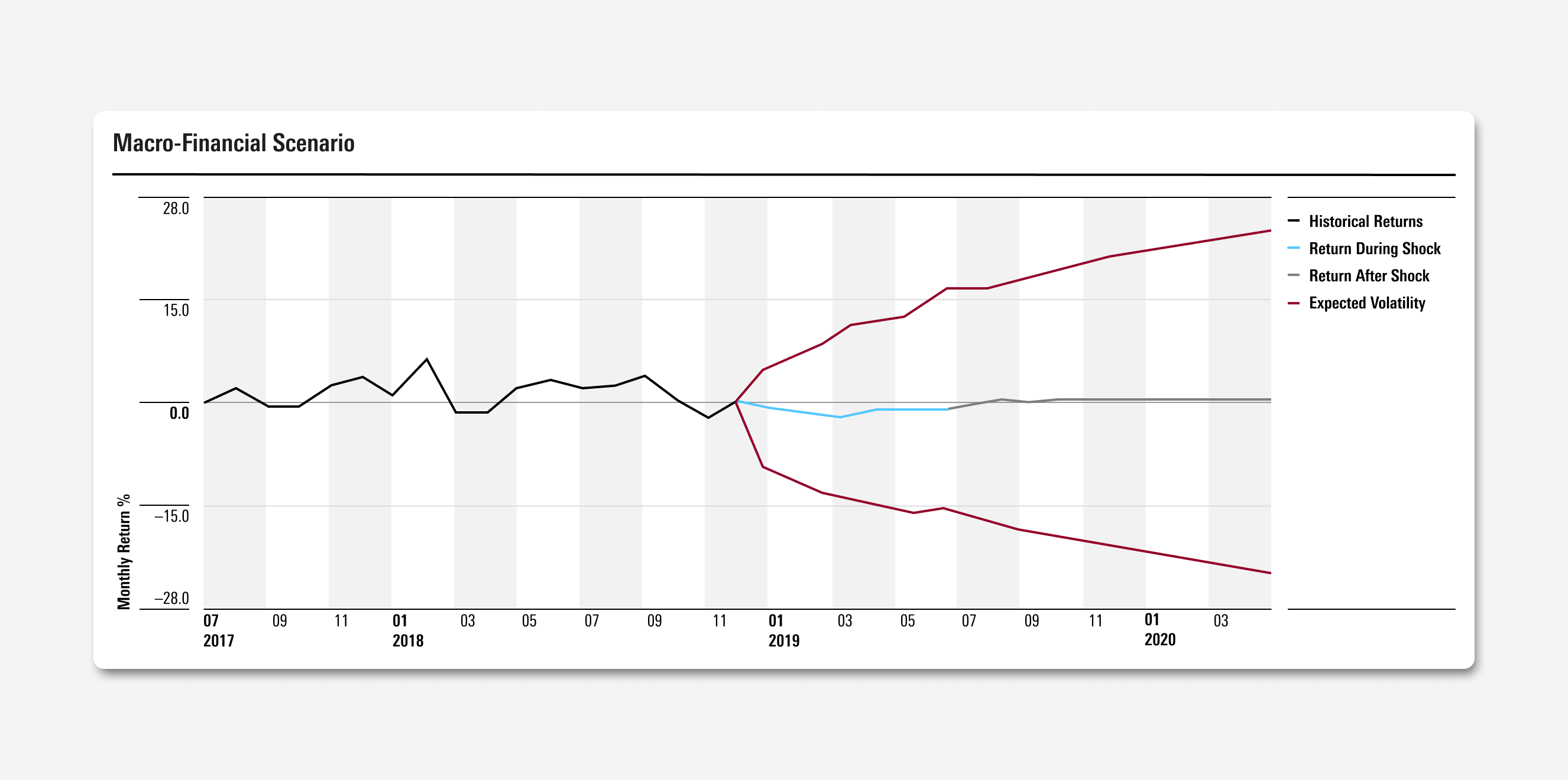
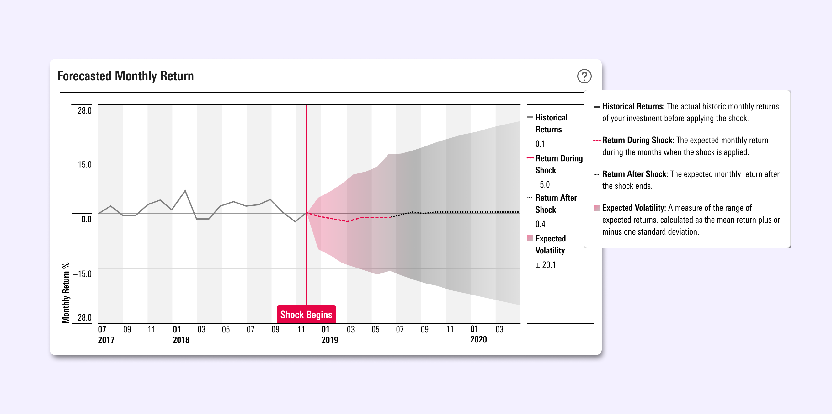
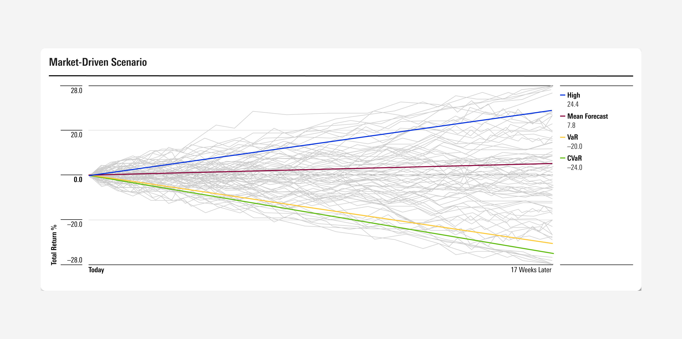
The ultimate task in this project was in creating a visual result of a ran program — the charts shown — that visually distinguishes what is historical fact versus a simulated future: to make clear the difference between what is program-run, and what a user controls.
The solve:
Scenario Analysis is a tool meant both for the economist and the financial advisor. By employing color, different textures, and using area fill shapes instead of only lines to show range, we delivered on data visualization within a tool that is more accessible, offers more assistance to understanding complex methodology, and honors precision.